|


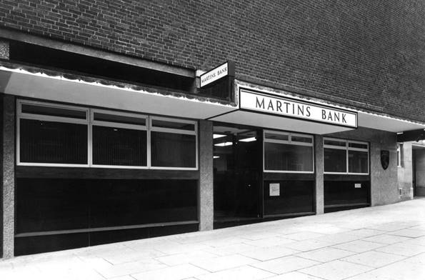
 This office, situated in the
appropriately named Bank Street, is Martins Bank’s fourth and final Branch to
be opened in the City of Sheffield. From 1966 in this rather unmemorable
brutalist building, Bank Street joins West Street, with its roots in the
Halifax Equitable Bank, Sheffield University Branch – opened in 1960, and
Sheffield Moor Branch, which in 1961 is opened as part of the regeneration of
Eyre Street following the bomb damage caused to the area during the Second
World War. This office, situated in the
appropriately named Bank Street, is Martins Bank’s fourth and final Branch to
be opened in the City of Sheffield. From 1966 in this rather unmemorable
brutalist building, Bank Street joins West Street, with its roots in the
Halifax Equitable Bank, Sheffield University Branch – opened in 1960, and
Sheffield Moor Branch, which in 1961 is opened as part of the regeneration of
Eyre Street following the bomb damage caused to the area during the Second
World War.
|

In Service: 1966 until 17 May 1985


Image © Barclays
0030-2600

|
|
Despite being “tucked away in a side street” as Martins Bank Magazine
puts it in the following article, the Branch at Bank Street survives the
merger with Barclays, and remains open until 1985…

 sheffield, that thriving industrial and university city where we have been
established for more than 60 years, now has four Martins branches, but the
most recent one to open is probably the hardest to find.
Bank Street is a side street which to the
casual observer holds nothing of interest, until he has driven its full
length and at last found a parking place. Then on the long walk back he
realises he is in the commercial centre with solicitors', accountants' and
estate agents' offices unobtrusively tucked away in elderly houses. sheffield, that thriving industrial and university city where we have been
established for more than 60 years, now has four Martins branches, but the
most recent one to open is probably the hardest to find.
Bank Street is a side street which to the
casual observer holds nothing of interest, until he has driven its full
length and at last found a parking place. Then on the long walk back he
realises he is in the commercial centre with solicitors', accountants' and
estate agents' offices unobtrusively tucked away in elderly houses.

Images © Barclays
0030/2600

|
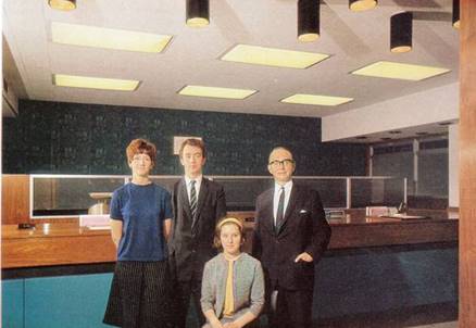
Mr
John Firth, the manager of the new branch, had wisely advised us to look
for the ABC cinema which one cannot miss when driving through the rebuilt
shopping centre, and sure enough just around the corner was the familiar
Bank name on the modern, glass-fronted premises. Just as every
branch has its own 'atmosphere', so each new branch has its own personality
for the design of a modern branch demands much more than the fitting of
desks, a counter and a manager's room into x square feet. Height and depth have to be considered along
with the siting of staff and storage rooms, safes and strongroom. Even
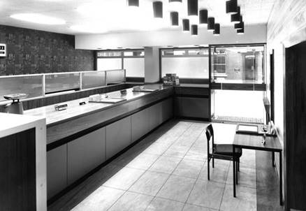
then the materials employed can easily kill the general effect. At Bank Street the lines are clean, the
effect is bright, the design modern and the materials of the very best.
Natural wood, and neutral coloured walls throw up the contrasting counter
front and bold patterned wallpaper at the rear of the banking hall.
Everywhere one feels that things are just right.
|

|

|

